CREATIVE BRIEF
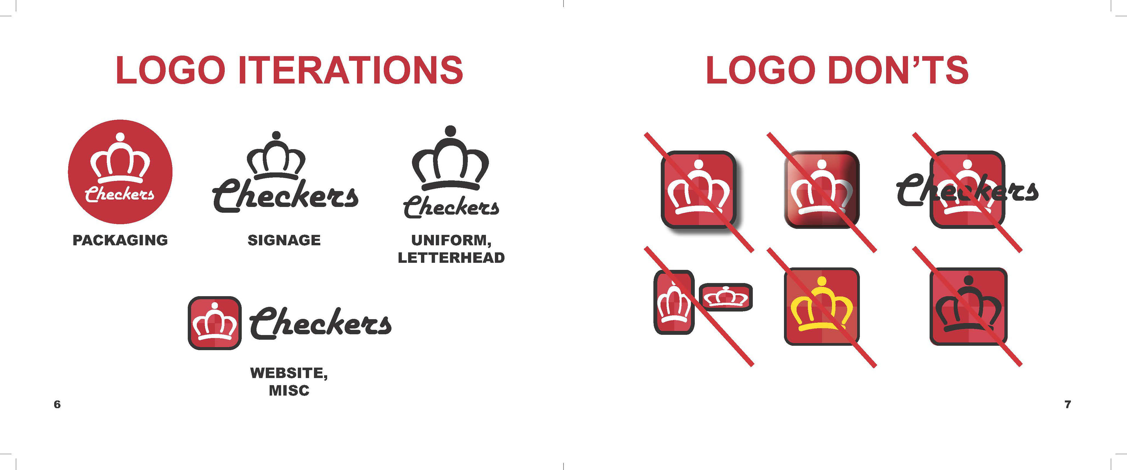
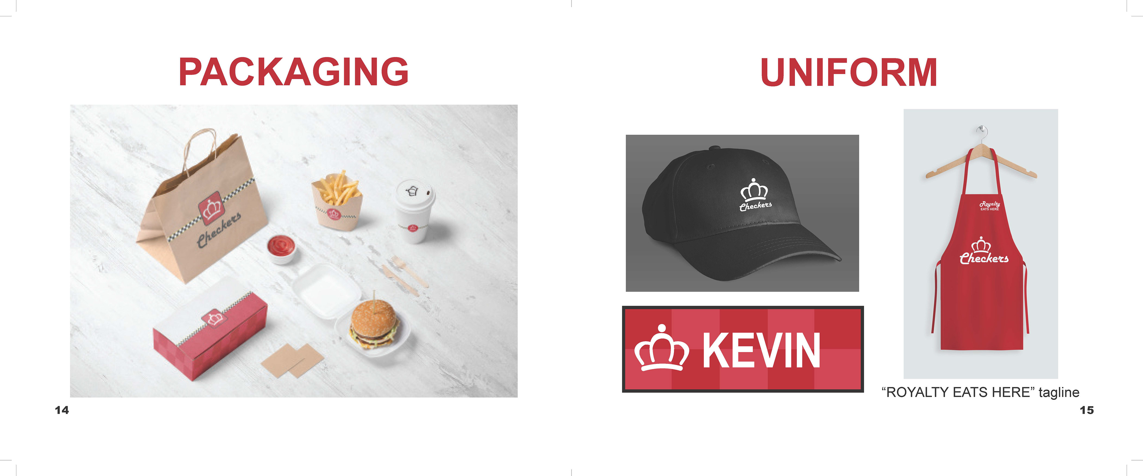
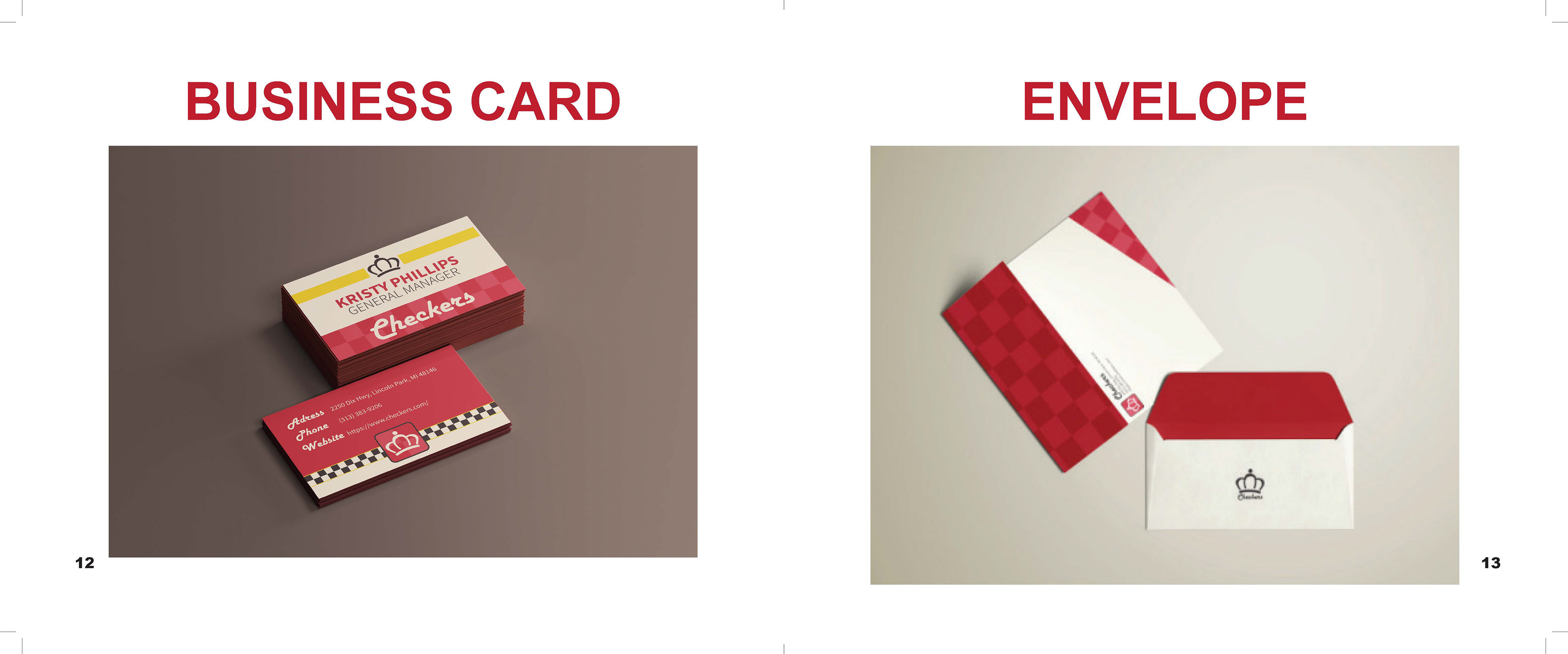
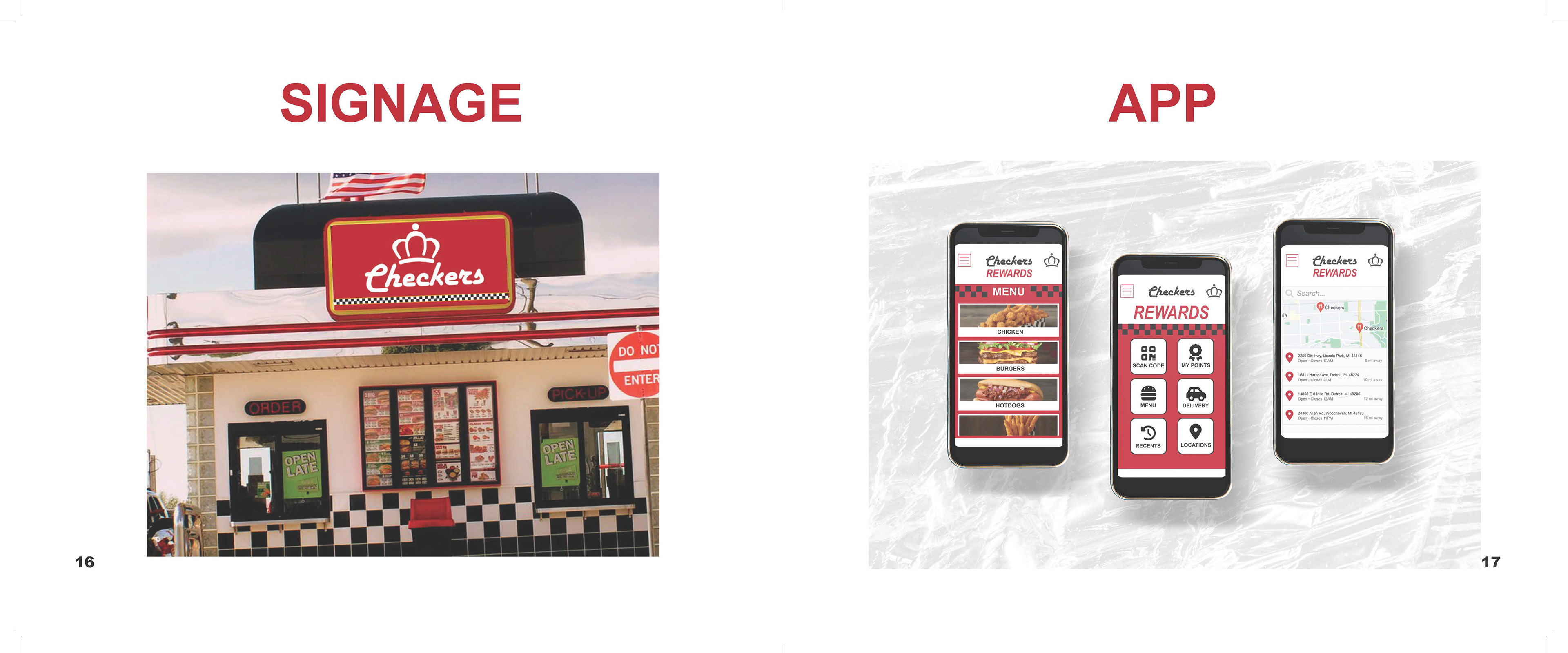
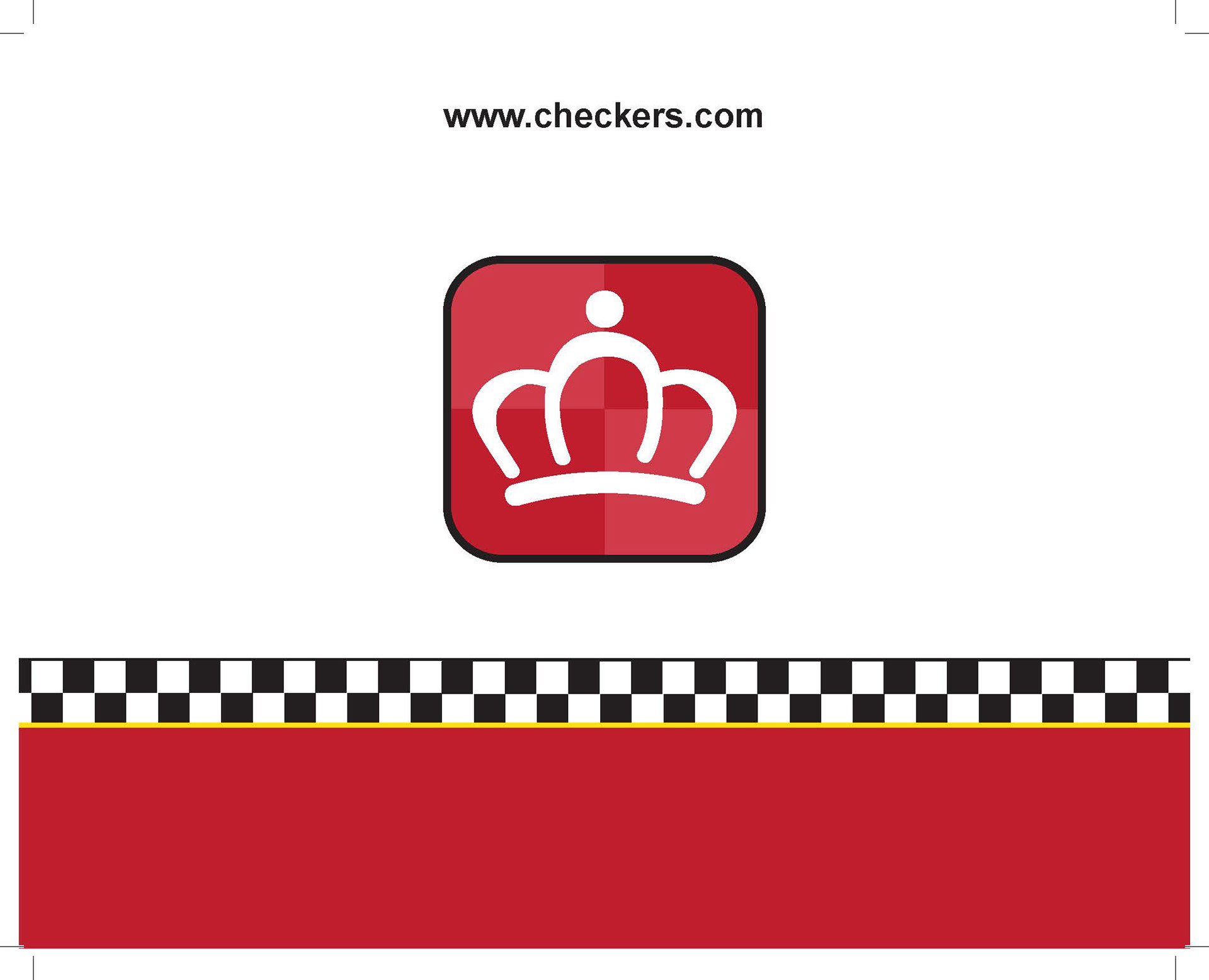
I took a logo from a brand I deemed in need of a makeover then designed an entire branding identity for them. I chose Checkers, therefore I needed to redesign elements such as uniform, signage, food packaging, etc.
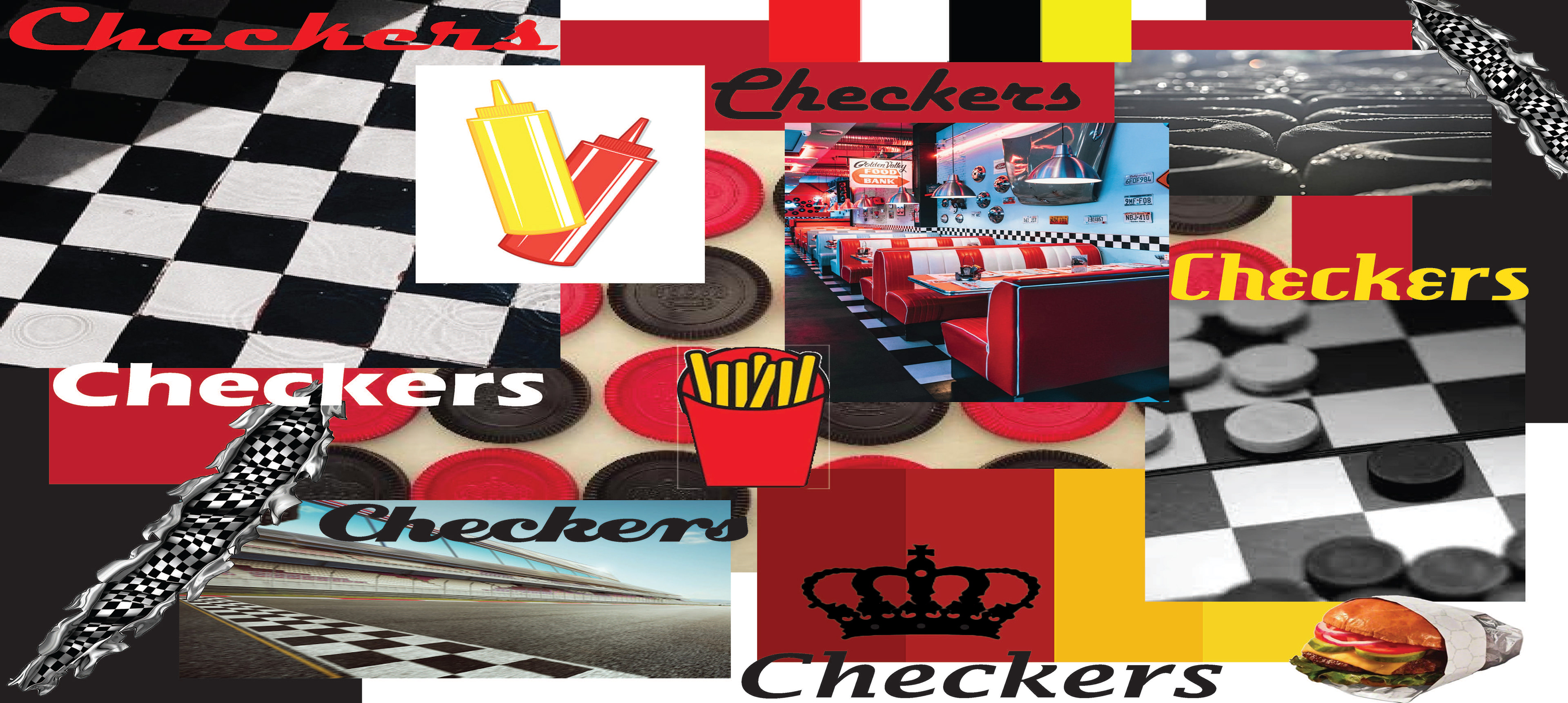
PROCESS
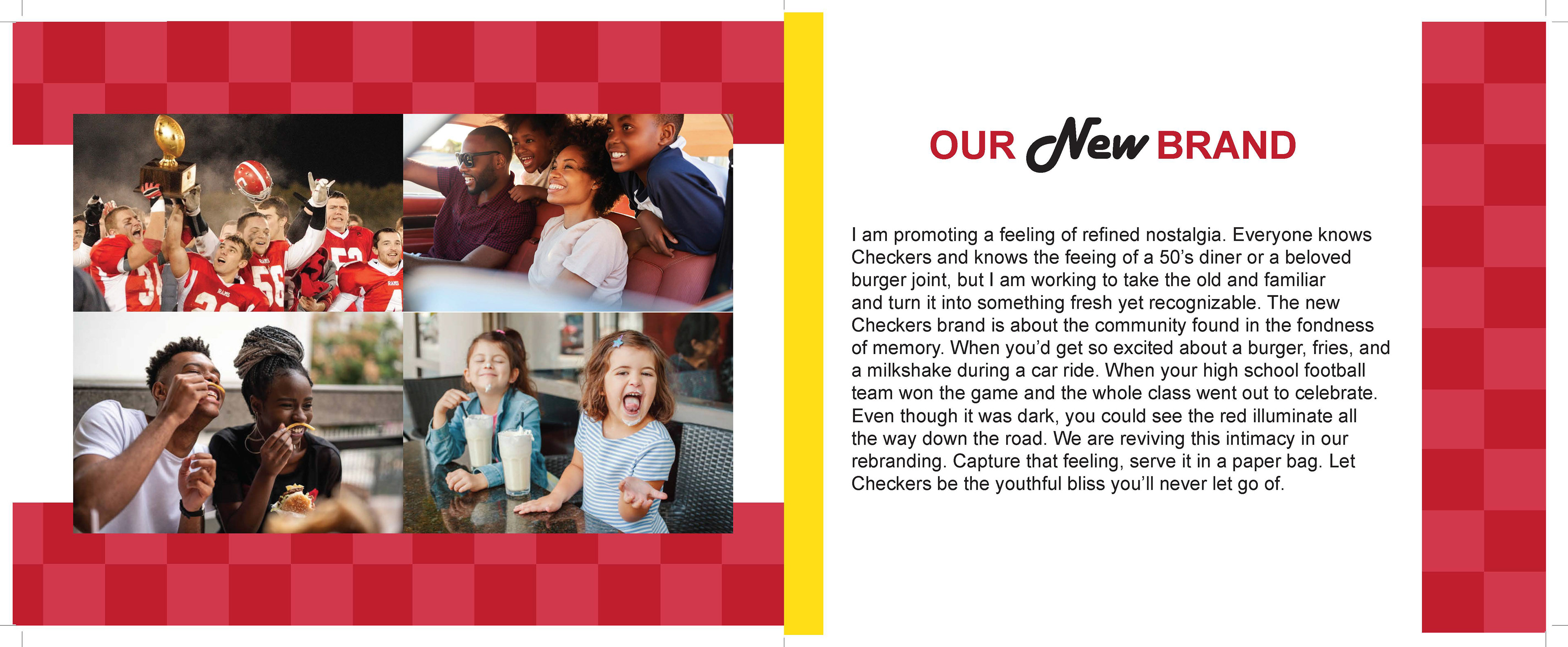
I decided to take a spin on the company name "Checkers" by designing them an icon of a crown for their logo. The Checkers crown is a reference to the tabletop game, because at Checkers you're royalty. After deciding upon my direction for the brand, I thought about the tone and feeling I wanted to portray. Knowing burger joints are classic and nostalgic, I took a modern revamp approach to elevate something we are all familiar with without jeopardizing the original 50's diner feeling.