CREATIVE BIREF
I was asked to redesign the packaging for a product that could use an upgrade and then create an ad to show off their new look
PROCESS
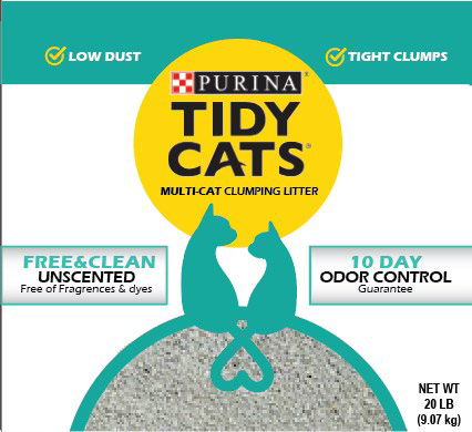
I chose Tidy Cats because I thought it would be an interesting challenge for myself. There’s nothing necessarily wrong with the original packaging. Sure, there were a lot of gradients and colors that could be toned down, but it was nothing horrendous. I just wanted to give the brand more of a graphic, modern look for their packaging. This would definitely be a lateral move for the company to improve what they already have going on.
As for my ad, Tidy Cats often incorporates humor in their promotions. A waterfall of litter is both ridiculous in the sense it's over the top and shows the product is refreshing. So, I present to you Cat Paradise!


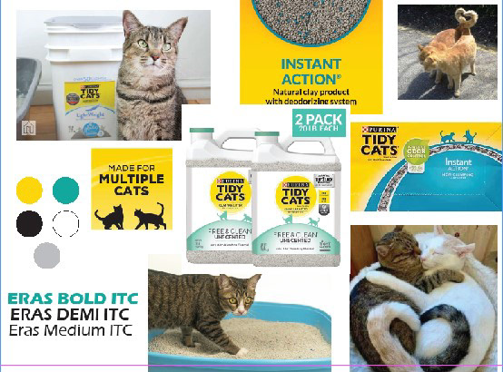
Moodboard
Work in Progress
